Saturday, September 29, 2012

Shasta

I admit it, I struggled with this case from CSI.  They just did not speak to me and I wasn't sure where to go. I had had a very difficult week and I think they just didn't match my mood.  I wanted to focus on something other than what I was going through so I decided to use these photos that I took of Mt Shasta on the way home from a family funeral.

For my evidence I used dots and stripes, used my craft knife to distress my strips, and used circle gems.  My testimony is handwritten and scattered about.  I journaled about my soul feeling parched after time spent in S California.  Funny, kind of speaks a lot about how I was feeling anyway and needing to be refreshed

The layout


The case file

Friday, September 28, 2012

Laura & Dad's Great CA Adventure

The challenge:
Use numbers on your next project

My dad and I recently took a trip to attend a family funeral.  The occasion was hard, difficult, and sad, but spending time with family was so wonderful.  Especially the road trip with my dad.  I didn't bring my big camera, instead I just used my phone and the Instagram app.  I am loving this app more and more.  For one thing, I always have it with me and the filters are super fun and you really do get those snapshots of life; just your ordinary day.  And on a 12 1/2 hour drive, it is something to do.

I complied all my snapshots of things along the trip, printed them out, and placed them in a grid pattern.  The idea I got for using numbers comes from the Visa commercials that give the prices of items purchased and then the punchline is the time spent or the joy given is priceless.  That is how I felt about this trip.  We spent many hours going many miles, but time with my dad was priceless.

The journaling says:
753 miles
5 days
2 In-N-Outs
34 family members
105 degress
time spent with my dad - priceless

The layout

Thursday, September 27, 2012

Family Beach Day

It's Thoughtful Thursday at thinking*through*design and today we are thinking about adding dimension to our projects.  Come on over and see our thoughts on this very important design technique and how your can add it to your next work of he{art}

I pulled some photos, for my nephew's first year album, of meeting family at the beach on a trip to Cali.  I saw these papers online and had to get them for these very photos!  I love the distressed look of them and there were really cute embellishments to use for beach photos.  I used Ashley Horton's September sketch too.  Of course, I turned it into a double pager ;)

The layout

The sketch


Wednesday, September 19, 2012

Photo Bomb

The Challenge:
Use a camera embellishment

We have so many photo bomb photos in this house!  They never seem to get old either.  It's just who we are.  I thought using the film strips and the cameras for this topic would be a lot of fun!  I added the fun arrows and paint splatters so that no one is in doubt that these photos are all about the fun.

The layout

Monday, September 17, 2012

You Light My World

The challenge:
Use a sunburst or beams for your next project.

It's been a hard couple of weeks for me and I really wanted to focus on some happy layouts.  Nothing makes me happier than this man.  He is someone who I love having in my life, spending time with him.  He is my rock and makes me laugh when I need it most and sometimes when I don't think I do need it.  He is the light in a dark week.  What better use of the sun rays than showing someone who brings light to my dark?


The layout

Friday, September 14, 2012

Blue Pool

I saw these colors for this week's CSI challenge and immediately thought of these photos from our recent hike to the Blue Pool.  I love this hike!  The trail is so pretty and the pool at the end is just gorgeous!

For my evidence I used a painted sun, beads in the center of my flower, wooden hearts, and wood grain paper.

I used photo corners on my journal spot too.

The layout

The case file


Wednesday, September 12, 2012

Coast Faves

The Challenge:
Outline parts of your layout with a twist of breaking up a busy piece of patterned paper into smaller shapes

Case #34 had some really pretty colors and I thoroughly enjoyed using them to create a soft layout of a recent trip to the coast.  One of the CSI Coordinates was a piece of chevron paper.  I have a hard time with chevrons, so breaking this pattern up was a great way to incorporate it into my layout.

I love to outline pieces of my design elements, so I jumped right on board with this challenge.  I outlined all the circles floating through the page, plus I outlined my misted clouds.

For my evidence I used wet mediums, waves, birds and watercolors.

My testimony lists my 5 favorite things to do at the coast
1. Walk on the beach
2. Listen to the surf
3. See the beauty
4. Eat at Mo's
5. Spend time with you

The layout

The case file

Tuesday, September 11, 2012

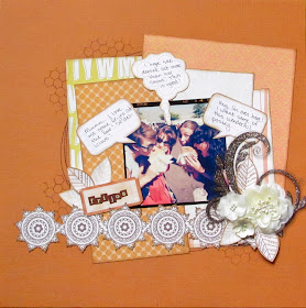
Frijos

Just in time for Fall, the folks at CSI brought out these rich, earthy colors to use for the latest case file, #36.  I love earthy colors!  I am really focusing on making some fun layouts to counter the difficult week I've had and am having.  They are having the fun twist of having a sketch included with each case file by Once Upon A Sketch!  I love them and they have some fun sketches.

We went to the fair recently to listen to one of our favorite local bands and you must get a frijo when you go to the fair!  A frijo is similar to an elephant ear, but it is more compact, moister, and so delicious!  We got two to split between 5 of us and took this super fun photo.

This week's case included the journal challenge of using conversation bubbles to house our journaling, so I thought they would be perfect to include some fun "thoughts" while we were chowing down.

For my evidence I used: the included sketch; leaves, mesh on my flowers, including alphabet in the design, tone on tone, and curved design.

The layout

The case file


Monday, September 10, 2012

Birthday Luau

The August sketch at Club Ck is a fun one and one that easily turned itself into a double page layout!

I won the American Craft's Shoreline collection and it is chock full of fun, bright papers.  I decided they were perfect for the photos of the surprise luau Bryon, Leah and Chris threw for me.  They are such good kids :)

The layout


The sketch

Saturday, September 8, 2012

Cut Me A Break

The Challenge:
Use mini envelopes on your next project

I have always struggled somewhat with using envelopes for my journaling because you can't easily see it.  I decided to tell this story of John and Bryon's endless battle over how Bryon's sandwich is cut.  Bryon just wants it cut normally, John likes fancy.  He cuts Bryon's sandwiches in such a myriad of shapes, that I decided to use my envelope to house the "secret" cutting files.

It's nice to know that John is on the cutting edge of scrapping trends too, using the ever popular chevron for this yummy sandie.  

The layout


Friday, September 7, 2012

Heceta Head

This layout is a companion piece to my layout for case #32 over at CSI.  I have loved using my paints, sprays, and fiber paste!

My evidence is: clouds, bricks, wet mediums, sand like stuff, triangles, and nautical elements.

My testimony tells of the great beauty of this lighthouse, right in my backyard.

The layout