Monday, December 1, 2014

Mr Suave

Welcome to the Scrapbook Generation Blog Hop for December. If this is your first stop, you might like to start at the Scrapbook Generation blog and then hop through each link. 


These photos are from my son's wedding and using my Scrapbook Generation sketch books makes for a super easy way to plan a wedding album. I had over 1500 photos to choose from and found myself a bit overwhelmed.... I sat down with my sketch books (I have all the double page books), the wedding photo files, a pile of Post-It notes and set to work. I broke down the day into happenings, looked at the photos that fit, counted up the ones I wanted to use, and found a good sketch. Then I sized each photo, added to a letter paper sized page in Photoshop, put a sticky note on the sketch I was going to use that told me what photos belonged there. After all my photo collages where ready, I printed. Printed for days. I printed the whole wedding album at once. Really I printed two wedding albums because I am insane and made two; one for them and one for me. I think my stack of photo paper was around 2". It made it really nice to take to crops. The photos were already printed and the design process was done.

For this layout, I used a 7 photo sketch from Volume 1 of my double layouts book. I kept pretty true to the sketch with the photo placement and little boxes, but added a lot of manly doodads. The finished piece really fits these boys well.

You can find the SG sketches in their books and as downloads in the SG store, and there is a free one every month in case you wanted to try it out. Be sure to stop by Lyne's blog. Be sure to leave a comment on each blog and one lucky commenter will receive a free sketch bundle of their choice from the store.

The winner will be drawn on Monday, December 8th, so you have plenty of time to leave a comment. 

Sunday, November 9, 2014

Geyser

There is a fun new challenge blog called Words & Paintery and it looks to have a fun mixed media twist to it. Looks like a lot of fun. The first challenge was to use two shades of blue and a dark teal and had the word prompt of "paintery".

I took these photos on my visit to Yellowstone last January. I could stand and watch these geysers erupt all day long. They make the coolest sounds and spew out amazing water droplets. This particular geyser allowed you so close that you actually get some water spit on you. It was super fun to try and capture as many suspended droplets as possible.

For this one I started out with a blank piece of watercolor paper. I thoroughly wet it down and added blobs of blue ink, letting it flow and pool. I like seeing what sorts of designs form when I do this. Next I added some stamped scratches in the dark green. I pulled out some cheesecloth and arranged it so that it was thin in places and thicker in others. I clustered my photos on top then sprinkled some clear skittles, mimicking the water droplets in the photos. I then added some gears, clouds and gems. The plain clouds are covered with glossy, giving them a thickness and shine. Add a title and a bit of journaling, and we are done! 


Wednesday, October 29, 2014

Hobbit Hole

I am super excited to be a guest blogger on Balzer Design's blog today! Seriously, I found and loved mixed media through this blog AND I have so many of Julie's stencil designs in my collection.


Be sure to visit Julie's blog for the full tutorial on using gel medium for a resit.


Monday, October 13, 2014

Silent

This week's case at CSI was a really interesting one for me. I loved the sketch and the inspiration photo was so interesting, but when I got to the journal prompts, I knew exactly what I was going to do. See, sometimes I struggle with feeling like I have nothing worth hearing, so I stay silent. It's something I've struggled with, off and on, always. I was actually quite shy and quiet as a child and those feelings rear their ugly head from time to time. One day I was feeling particularly on the outside, so I poured out my feelings in a free poem. Writing poetry is something new for me. I have always believed that I couldn't write. Sound familiar? Actually, a lot of the rules elude me, but I don't need to worry about all that in poetry, so I have found my sounding board.

I went out and snapped a few selfies to support the story, turned them black and white, added them to a film strip frame file, and cut them apart to add to my banner.  To make my background, I masked off one half of my page, got it good and wet, sprayed with spray mist and stamped to add texture.  Then I masked off that side, brushed red paint, stamped a cool gear stamp all over, added some watered down grey on top to calm it down. I then just started throwing things into a banner position, adjusted bits, added bit, removed bits, and glued everything down. I cut some clouds out of book pages, printed off my poem, cut it up into strips, and adhered all those down. I decided to let the last word in the poem stand as the title. It's what the whole piece was about.

Evidence used: mixed media background, bird cage, birds, frame, gears, circles, book pages, typewriter, and clouds.

Testimony is a free verse poem.

Silence crashes all around me
Words unspoken
Feelings tamed
Like wild animals behind bars
Silence rings deafeningly
Lips are still
Eyes plead
Hear me, oh hear me
Silence bullies its way in
Do not speak
You have nothing to say
Shush
Silence roars from the distance
Alone
Unseen
Silent


Monday, October 6, 2014

Take To The Sky

Summer of Chaos Catch Up continues!  When I first glanced at the color palette for August Scrap 365, at CSI, my heart sort of sunk.  They are not colors I use at all!  At least not together.  So pale, so light, so boring?  The inspiration photo helped at bit with that awesome drawing of hot air balloons.  I had just purchased a balloon stamp set and had my photos taken on my trip to SLC, from the plane, so I set to work.  First thing I did was take my favorite cloud stencil, by Julie Balzer, and stamp with distress inks, from the color palette, mist, then press onto my water color paper.  If you haven't seen the Tim Holtz technique he used on his June tag, be sure to check it out here.  It is awesome and I use it a lot! Because the colors were so light, I doodled in the forms of the clouds and added some curly cues for a whimsical look.  Then I stamped on some flying birds and circles.  I stamped, embossed, and colored in some hot air balloons, then fussy cut.  I added some strips of washi, including a travel themed one, for a matte.  Added a photo cluster and arranged my balloons, some die cut clouds, gears and propellers.  I added some sayings and my title to some hand cut banners and placed them on the balloons, like they were being flown as advertising.  For a case that I did not like, at first glance, I LOVE the finished piece!

Evidence used: clouds, hot air balloons, birds, doodling, polka dots, string.

S365-7 - Take To The Sky

Sunday, October 5, 2014

Tree Bones

Back to my Summer of Chaos catch up.  I really loved this CSI case.  I loved the colors, the inspiration photo, the prompts.  I have a special place in my heart for Asian design.  Love the looks and mixes of color and pattern.  I was excited to be able to play with the design for this case.  I took my friend from Phoenix to the Japanese garden when she was here.  It's one of the few places she requested to go.  I love going.  There is a Japanese maple there that is somewhat famous.  There are whole websites and Flickr groups dedicated to That Tree.  I remember the first time I saw it; I almost walked right passed it!  To get the uber cool photos, you need to lie down on the ground.  This time, the leaves were not on the trees so I took a series of photos of the "bones" of the tree.  I love how they twist and turn and look like a gnarled old man.

To make my page, I used a brayer and just a touch of cream paint to create a matte.  Then I took an Asian writing stamp and added on top of the paint.  I found an assortment of patterned paper bits from 6x6 pads and punched them into hexagon shapes.  This is part of Asian decorating to me; they use patterns and colors together that you wouldn't normally thing to use.  I arranged the pieces into a quilted like pattern, then added the photo cluster on top.  I took some other Asian style stamps and stamped and fussy cut them, turning them into corner brackets.  All I needed to do was add a tag with my title and a few bits and write a Haiku.  I LOVE Haiku.  I even looked up the Kanji for Tree Bones

132 - Tree Bones 


Saturday, October 4, 2014

Tide Pool

And onward I go in my quest to catch up from the Summer of Chaos.  One of my favorite places to go is to the coast.  Nothing quite settles my overwhelmed mind like the soothing sound of the crashing surf and the salty air.  It has become our go-to escape.  I was so excited to see that Tim Holtz released the sea life blueprint stamps!  I go so often, I know I will use them a lot.  I actually ordered in the car on my trip back home.  I love going to this particular beach.  It has a gorgeous lighthouse and fun tide pools.  The perfect subject for my new stamps, right?

To create the background, I applied some bead gel medium through a circle stencil, then stamped the circles with a pale grey.  Next, I stamped three sea life blue prints right on my page and used watercolors to fill them in.  Add my photo cluster, and some twine with a few metal tags hanging down.  Simple, yet really pretty and peaceful.

Evidence used: polka dots, suspend something, ribbon, watercolor, and tie something.

133 - Tide Pool 


Friday, October 3, 2014

Work & Create

I seriously loved the fun colors and topic this week at CSI!  I know I have my right brain side and my left brain side.  Nowhere is this more evident than the state of my two desks....  In order to feel successful at work, my desk MUST be neat and tidy, whilst my scrap desk is an utter disaster!  Both spaces work for what I am doing when I am at them.  It seriously makes me giggle.  I thought the best way to showcase this was to make a layout with stark contrasts between the two.  I used some painter's tape to divide my piece of watercolor paper in half, then set to work making a beautiful mess on the lower portion.  I used paste and ink and let stuff mingle and drip.  I love it!  To highlight the orderly me, I made the top half very neat and clean.  Orderly and straight.  Full of office embellishments.  I am really pleased with how it turned out.

Evidence used:  plain white background, grid, ampersand, stars, phrase sticker, and circles.

Testimony is about the two side of my brain; the work brain and the create brain and the desks that support each.


Thursday, October 2, 2014

Cape Blanco Lighthouse

This month's Scrap 365 case at CSI is super fun and I love both the color palette and the inspiration photo!  I decided to use some recent photos I took when we went to the coast.  I know, I know, big surprise that we went to the coast, but this time we went further south and visited a lighthouse that I have never been up.  This one lets you go right into the lens room and let me tell you, it is a photographer's dream!  So many cool textures, angles, and abstract designs.  I could have snapped away all day as the giant lens turned.  It's one of the few lighthouses they let you in.  So glad we went!  It had been very foggy when we first arrived, but by the time we go up there, the sun was streaming in and it was absolutely glorious.  

I kept the layout simple so the photos could really shine (snicker).  I placed a circle stencil on my watercolor paper and gently misted with the teal color.  I made my photos all the same size and matted onto some red cardstock.  I layered some patterned paper and placed the photo matte on top.  I cut some clouds out of plain teal cardstock and vellum and scattered them about, adding a couple of die cut birds.  I decided to make a couple of half circles out of gems.  They just mirrored the shining circle patterns in the photos and fulfilled the half circle prompt.  I decided this would be a good place to add my title.  I journaled on a couple of the clouds and all done!

Evidence used: clouds, birds, semi-circles, textured paper, layering elements, misting, and vellum.


Letting Off Steam and Sunshine

Hello, and welcome to October!  We have another double inspiration photo challenge, at Scrapstuffz, but we've added a twist; a word prompt to go along with each photo.  You can do one or the other or both to be in the running for the prize.

For the first photo, I decided to just go with the uber cool, icy look and dove into my Yellowstone in winter photos, and I used photos of steam being let off for the verbal prompt.  I first got a piece of watercolor paper soaking wet, then added blue spray mist.  I finished it off with some stamping with a sapphire blue ink pad.  Then I got out this cool circle stencil, applied modeling paste, then sprinkled with silver glass glitter.  For my matte, I cut off some strips of gauze, inked, then dabbed with white paint. I added my photos and die cut some clouds out of white paper and deli paper.  I went to add some more white paint, through a stencil and got some on one of my photos.  After a few seconds of frustration, I added some more on all the photos. I think it turned out cool!  A happy accident.  I finished off the piece by adding a title and some wooden trees, along with a bit of journaling.


Verbal Prompt: Let It Go

For the second photo, I went to my quotes board on Pinterest, to cover the verbal prompt, and the very first pin there just struck me.  I could really use that advice right now.  I found a pretty photo of a sunburst through fall leaves.  I love how you can see the rays actually coming out.  To create my sunburst, I applied modeling paste (seriously awesome stuff) through a sunburst stencil, then colored in with distress ink (after the paste dries, of course).  I used just one color, but added more in some spots to give the variegated look. I created a layered matte with some fun Fall color papers and added some cute embellishments and finished off with a sprinkling of stars. The final bit was to add a big title, that also stands in for my journaling.  The small letters are Fancy Pants sticker letter, that I outlined, and the large word is made up of Thickers. 


Verbal Prompt: Words To Live By

There is how I was inspired by this month's photos, let's see how you are inspired!

Tuesday, September 30, 2014

1, 2, 3 Slide

Back to my Summer of Chaos Catch up.  I really loved the whimsical inspiration photo of this CSI case, so I decided to make my piece a whimsical one.  I haven't done a lot of whimsical layouts lately, but I really like them and need to do more.  I took a trip to Salt Lake City in May to visit Adele.  We spent a lot of time with her 3 year old nephew.  This day we went to a nearby park to play.  As Adele was taking care of little brother, the 3 year old grabbed my hand and led me to the playground.  He had me watch as he went down the big curly slide, a recent accomplishment for him, then decided it was my turn to slide.  He grabbed my hand, took me to the top and said, "Go down Auntie Mooney".  What do you do?  You cram yourself onto the slide and go, all whilst your friend is snapping pics.  Ah....to be a kid again, if only for a little while.

Evidence used: sun, bird, transportation element, metal, clouds, circles.

134 - 1, 2, 3 Slide!

Monday, September 29, 2014

Ice

Summer chaos catch up time!  A month of pink and I had a really hard time with this week's color combo at CSI.  So many bright colors that I don't normally use!  I had no clue where to go with them.  I did like the blue in the pallet and it reminded me of ice and it was the middle of summer and an ice layout might be a nice break.  I took a trip to Yellowstone in January and some some super cool (hee hee) photos of icicles, so I pulled them out, created a grid piece, my sunburst stencil from Tim Holtz and set to work.  I turned the sunburst upside down to mimic the icicles.  I simply took a pen, outlined the pattern, and filled in with a shimmer watercolor blue.  I added some glittery, long triangles and sparkle washi tape to add to the icy feel.  For the rest of the background, I used a cool bubble stencil, outlined with pen, and used various watercolors from the rest of the palette to give a cool watery effect.  I used the acrostic journal prompt and the word ICE.

Evidence used: triangles, grid, polka dots, arrows, and sparkles.


135 - Ice

Sunday, September 28, 2014

Truffle Trot

Playing catch up from a chaotic summer.  August seemed to be the month of pink at CSI.  Every case had pink in it.  I had to giggle because my BFF and fellow DT member HATES pink.  It was fun to see how you can work pink into all sorts of color combos though.  I loved the black, it just make such a wonderful background that makes everything else pop, so instead of creating a mixed media base, I used plain black.  First thing I did was use some white modeling paste over one of Tim Holtz's new layering stencils and LOVED how it just popped off of the page!  I built up a layered matte for the photos from book pages, tags and paper.  Add a few die cut banners (I really love this new banner die set) and journaling and a pretty fast page is done.

Evidence used: book pages, floral pattern, lace, string, wet medium, mesh (stencil).


136 - Truffle Travel

Saturday, September 27, 2014

Voodoo

The case this week at CSI was super odd, super interesting, and I had the perfect photos to use!  In Portland there is a very iconic and famous eatery called Voodoo doughnuts.  They are famous for their unique toppings, like cereal and bubble gum.  The signature confection is a voodoo doll that is filled with a red filling and has a pretzel stuck through the heart.  The line at the Portland can be blocks long and my friend who was visiting from Phoenix was a little disappointed in the wait.  It was really warm that day too.  I told her there was a branch in my city, so we decided to wait and hit that one.  MUCH shorter wait time.  I liked how the New Orleans style shop and voodoo theme used the color palette perfectly.

I decide to really layer the piece, as layering was one of the evidence prompts, and I think it just added to the weirdness.  I think layering papers and embellishments is what comes to most people's minds when we talk about layering, but I layered art mediums.  I started out with a base of gel through a harlequin stencil (another shout out to New Orleans) then set to work layering distress inks on top.  To do this, I stamped my splat mat with distress ink pads, spritzed with water and turned my piece, face down, on the ink.  I let them drip and dried with my heat gun.  I kept adding layer upon layer until I achieved the look I wanted.  My unusual bit was to wad up some deli paper, like you get served on, dip it in ink and add under the photo.  Then I added some stamped birds, a washi tape matte, gears, clouds, journaling, and sequins.


Friday, September 26, 2014

Let Your Light Shine

Another post in my CSI catch up.  The colors of this case were so pretty, just sort of reminded me of light shining through the fog, and the perfect palette for some photos of a lighthouse lens.  We have a great lighthouse that is pretty close to where I live.  It's been closed and under renovation for a couple of years.  I just happened to reopen just in time for a visit from a friend from Phoenix, so we signed up for the tour.  The history and architecture is just amazing.  Life as a keeper was not an easy one.  As renovators, they try to keep as true to the original design and products, and this meant some super cool "sky light" glass was left intact.  I love that it's purple!  You can't go up into the lens room, but get a pretty good view from below and it makes for some interesting photos.  This is a working lighthouse too.

I decided light and airy was the way to go, so I started off with one of my favorite stencils, designed by Julie Balzer, and stamped it with distress inks, misted, laid down on my watercolor paper, and dried.  Makes for a super cool watery background.  I went in and outlined some of the circles with a grey pen to add interest.  The rest was a matter of cutting out banners, swirls, and clouds, penning them, embossing some gears with silver, painting some wood, and adding some gems.

Evidence used: polka dots, washi, swirls, melt something (embossing powder), wood, triangles, and metal.

137 - Let Your Light Shine

Thursday, September 25, 2014

Shop

I am doing a little CSI catch up right now.  Summer was super busy and a lot of trials took place.

One of the things I did was go visit my mom and was able to spend some time in the shop with my step dad.  He is a master in the shop.  He creates the most beautiful things, especially turned bowls out of cool pieces of wood.  My mom decided to teach me weaving on her small ridged heddle loom and I needed some spindles and spacers.  Why buy boring ones when you can make your own in the shop?!  I traced some of my mom's tools and get to work.  My step dad helped with some of cutting, but the real magic happens on the sanders.  All the formation happens as you twist and bend the wood on the sand paper.  It was great fun!

For my background I pulled out a piece of cardstock and stamped the wood grain with this awesome stamp by Stampin' Up, then I put down a damask stencil and used some Tim Holtz pink distress paint.  It's kind of hard to see the damask pattern, but it's there.  I had this great piece of Crate Paper with the ruler on it, so cut it out and placed it in the space where the stamp didn't fill, at the top.  I also had a great wooden ruler and some pieces of wood veneer that looked like they belong in the shop.  I embossed some "corrosion" on some gears, found some fun letters, made an envelope from grid paper to hold my journaling, and done!

I used: wood/wood grain, damask, grid, envelope, ruler, tags, a key, triangles, and paint.


138 - Shop

Wednesday, September 24, 2014

Green Dot

This week's case at CSI was super fun.  I loved the color palette and the photo of the kitties.  I decided it would make for a great piece about kitties.  Right now I don't have any of my own, but I have 3 grandkitties.  This one is Subi (you can just see his brother's ears peeking out in the larger circle photo) and he LOVES the laser pointer!  I decided to keep it simple and allow for the photos to take a larger roll as well as play with a whimsical look.


139 - Green Dot

Adventure Awaits

My never ending catching up from the Summer of Chaos marches on.  I had a lot of fun with this CSI case.  I love me some earthy colors and this case was full of them!  My daughter decided to do something different for her husband for his birthday this year.  She set up a geo cache style scavenger hunt for him.  She spent weeks planning where clues would be and what they would say.  She started planting clues a few days before the big event.  We were at the canoe leg, with a canoe, to provide help to one destination, if needed.  It was at a porta potty in the middle of the lake and a storm was whipping up, so help was definitely needed!

To start off with, I had taken a photo of some maps, a compass and my husband's glasses that were left out after a planning session.  I moved the photo into some phone editing apps and came up with an antique looking photo that I decided to use as my title.  I used my brayer to spread around some brown paint to act as a matte over the fun patterned paper.  I cut a variety of banners out of papers and some burlap, put my photos into a collage (all done on my phone), exported to the computer and printed off.  I used a Tim Holtz compass blueprint stamp and some odds and ends.  I also cut some clouds out of this cute graph paper design and found a brad that looked like a sun!  Add a few stars, and I'm good to go.

Evidence used: wet medium, wood, sun, clouds, eye glasses, stars, and brads.

131 - Adventure Awaits 

Tuesday, September 2, 2014

Double Photo Inspiration!

Welcome to September! I always consider this the start of the new year, not New Year's Day, and to start off with a bang, ScrapStuffz Inspired By brings you two inspiration photos! You can do just one or double your chances at being chosen as our fave and do both. Both photos are bright and colorful, but one speaks of summer and the other of going back to school. Great choices as we shift our focus from the lazy days of summer to back to school.

The first photo may be a fair ride, but it reminded me of hot air balloons. I like to think out of the box, so I went with a hot air balloon ride for my subject. My parents recently went to Turkey and my step mom and little sister took in a hot air balloon ride over some spectacular scenery! I asked for some photos to use for this post. I REALLY love how this turned out. I stuck to the earthy colors of the photos instead of the bright colors of the fair ride, though I got them in as accents.


For the second photo, I did a layout that I've been wanting to do for some time. It cracks me up when I think of my two desks. I MUST have a nice and tidy desk at work in order for me to work well. I clean up between projects, minimize the clutter, have things place at just the right place. My craft space is the COMPLETE opposite. Usually I just shove enough things out of the way in order to get going on my next project. I do pick up, but just enough to make a little room to move. I really need to sort and organize, but no way is that getting in the way of my creative time! I thought a layout contrasting these two desks would be a fun piece to do. I used office supplies for my work desk and drippy paint and such for my craft desk.


I hope you find some inspiration in this month's photos and I can't wait to see what you create!


Saturday, August 16, 2014

Doctor Who Mini Album

When I received my awesome TARDIS die cut, from ScrapStuffz by Stacia, in the mail, for my August reveal, I was soooo excited! It was awesome, really, it was. I decided that the larger size warranted using it to make a mini album and it would be perfect for photos of Adele and I, commemorating our time together and our obsession love of Doctor Who.


I placed the TARDIS on a piece of watercolor paper and traced the shape, giving ample room for a cool background and to give room for adding lots of photos inside. Then I grabbed some more paper and created a few more pages, four seemed to be good for the photos that I had. Next it was time to get artsy and create some backgrounds that were uber cool and spacey like. I chose a Gelli print that I had in my stash that had a suitably Whovian look. I used a bunch of adhesive and adhered it right to the paper. Next I added my TARDIS and adorned the light with a little gem.


For my first page, I used the technique that Tim Holtz used in his June tag. I took my favorite dot stencil from Crafter's Warehouse, inked in randomly with bright distress inks, sprayed with a little water, and placed it directly on to the two pages, using a paper towel to press down. It make a cool watery effect. Then I added some gear stamps, adhered my photos, adding gears, gems, and a key (you have to be able to get IN the TARDIS!). My photos didn't quite fit in the sketch configuration, but my gears are scattered much like the hexagons and I added the arrows in for the paper strips. The arrows convey action, motion and I thought they fit quite well.


For my next page, I dug in and found a super fun, super bright Gelli print (I love having a stash of prints to pull out for projects), and adhered to the paper. I stamped a circle stamp, in white, and hot air balloons, in black and outlined with white. More gears, and definitely gems, were all the page needed.


I have a lot of fun with the next page.  First, I used bead gel and my star stencil to add stars all over the page. Then I water colored with some blue shimmer paints. I removed the paint from the stars with a moist paper towel and then painted the stars with yellow shimmer paint. For the fun spacey bits, I applied gel over a cool techno style stencil, on a separate piece of watercolor paper, let dry, cut out the shapes, then dripped blue, red, and yellow ink, spritzing with some water so the colors would bleed. Of course, some more gears and gems were the perfect addition. I like that adding both of these lends both a masculine and a feminine feel to the page.


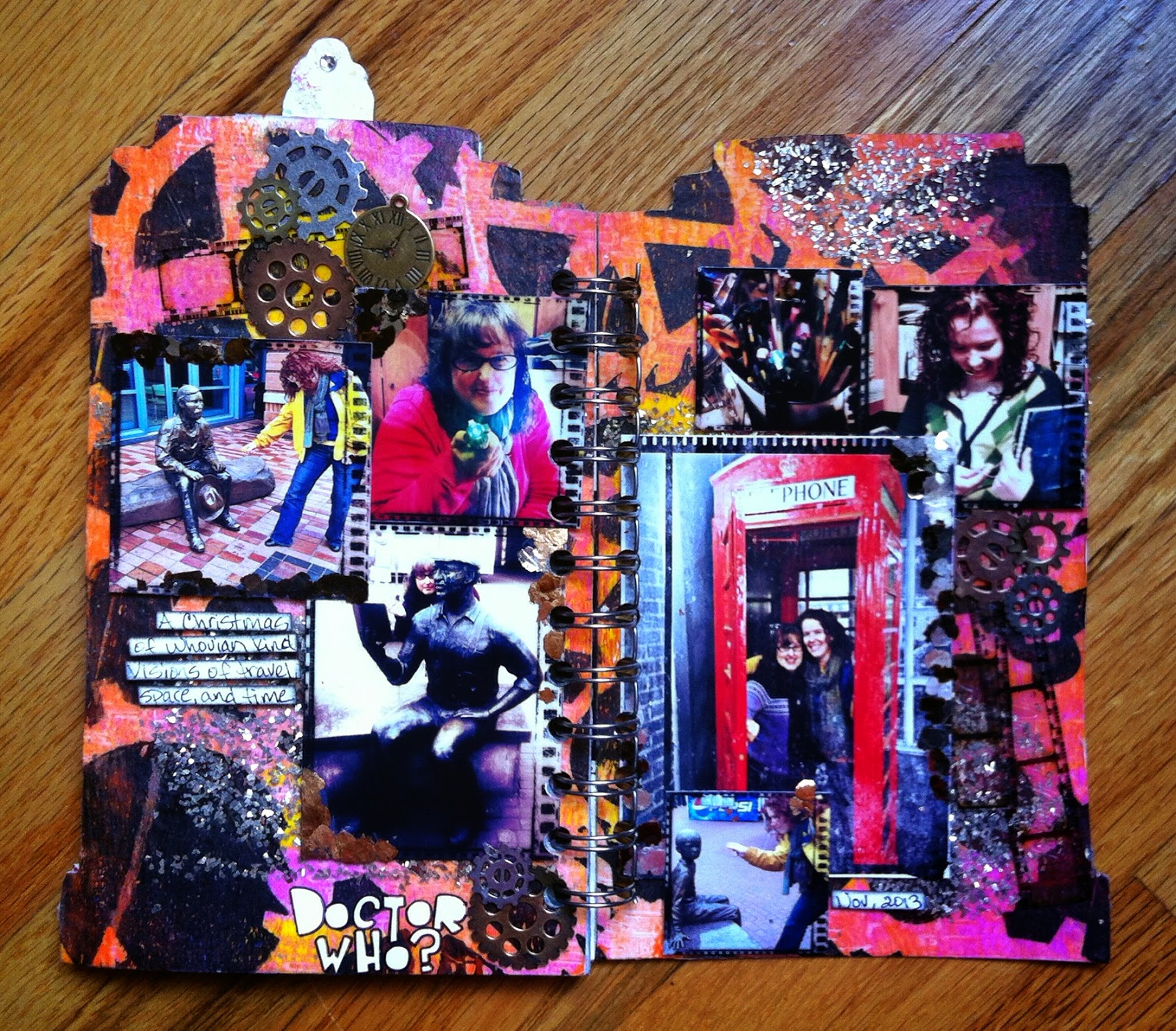
For my last page, I found a bright, fun Gelli print made using my gear stencil (hey, it's Doctor Who, there is a lot of machinery and gadgets!), adhered to the paper and then pulled out a circular stamp, stamped with a glue stamp pad, and sprinkled chunky metal glitter. I set this aside to dry and pulled out my gel and brushed edges and corners of my photos and added mica. I think this looked really cool. I pulled the pages back, but was not happy with how the glitter was holding on, and since this is a mini album, meant to be handled, I took it and sprayed with some spray art varnish. That totally did the trick and that glitter is there to stay! All I needed to do was add my photos, some more gears, and a few film strips.

I went ahead and pulled out another Gelli print to cover the back with, but I feel that I could simply add more pages in the future. All that needed to be done is bind it with my Cinch and I now have a wonderful memory of the fun Adele and I have together and with our obsession love of Doctor Who.

Be sure to upload your own project with your die cut or handmade embellishmen, maybe you even already have a die cut made by ScrapStuffz by Stacia, and the sketch made by Adele. If you don't have a die cut, you should be sure to order one, as they are awesome!


Wednesday, July 2, 2014

Gathering Place

I was so excited when I saw this month's inspiration photo at ScrapStuffz Inspired By! I love it! It's so cute and the perfect challenge to scrap my photos of the birds at my mom's feeder.  She has the coolest birds visit her. Cardinals, woodpecker, so many cute and colorful ones. We do not have cardinals where I live and I just love looking at them.  They are just so fantastic and I love sitting and watching them. It's amazing to sit and see a tree that is just dotted with all these cool birds.

I decided to add a bit of distress to my work. I used a wood grain stencil and some distress ink and water to make the watery moss like background, on top of the wood paper. I then took another stencil, a flower and bird one, some red distress ink and made the pop of red, in the background. I added my photo cluster and searched for a bird to add. I found this large wood bird and colored him red and added crackle over the top and positioned him atop some die cut twigs.

Take this opportunity to go out and look for some summer wildlife to photograph and share with us! I can't wait to see what you create.


Monday, June 2, 2014

Hello From Utah

This month's inspiration photo from ScrapStuffz was a super fun one. I just screams summer and vacation and fun, so was the perfect prompt for my epic trip to my BFF's house. Not only do I get to spend time with her, but two other friends and a crazy, whirlwind tour during the layover for another friend's daughter. I can't wait to see what the rest of my trip has in store for me!

I loved the brightly colored words, describing fun activities! I added fun letters and fonts directly on the photos in my grid. The words are all descriptive words about my trip. I also stamped icons on the photo too, resembling a infographic. I'm pretty pleased with how it turned out!


I can't wait to see what you do with this fun prompt and the fun and colorful layouts you will create!

Monday, May 26, 2014

Woof

I got a chance to play along with Child's Play this month! Life has been so busy lately, that I haven't had a chance to play along with challenges for months. I happen to be visiting my friend and have some extra scrap time, and these photos that I took of my friend's dog were PERFECT for this prompt, Scooby Do.