Friday, June 7, 2019

GIU Day Five - Design Principles

*sniff* here we are, my last day as the GIU gal. I'm also wrapping up my design principle series. There are plenty more, but I only had five days, so you I brought you the ones I think about most when in my creative space; whether it be creating cards, layouts, or a crafting a photo.

Today I am going to tackle flow. Flow simply means the way that your eye travels through an art piece. Now here in the Western World, we are trained to read from left to right, top to bottom. It's how our printed materials are laid out, so it's how we view art. There are a number of ways to help your view move through your artwork, but I'll look at two.

Left to right, top to bottom:

Like I said above, this is how we read, so this is the first way our eyes are going to think to move. Another way to think about this is our eyes are moving at a diagonal. Diagonal lines are something I always look for in a photo composition because I find it much more interesting than a straight line across and it causes your viewer to linger longer. I hope you can see this theme that runs through the whole week. You've invested time and heart energy into what you create and you want people to linger and enjoy, not just sweep through and be on to the next thing. To move simply from left to right or right to left, in the center, does just that. The eye just sweeps through and the brain moves on. By creating this diagonal line, you're inviting the view to take their time and enjoy.


Z line:

Creating a Z through your work, you're inviting your viewer to linger even longer, but still having order in your piece. An example of this is to begin at the top left, move to top right, swoop down to the bottom left and then end up at the bottom right. You see how much longer it takes to move through, using a Z line? My Z starts with the clouds on the left, moves to the cloud on the right, picks up at the bird and flower, follows down the mouse, and finishes along the grass.


I hope you have enjoyed this peek into what goes through my brain as I work and maybe even find it useful when you create too. It's been nice really thinking about why I do what I do and researching the why. Our brains are so cool and I love learning more all the time.

Be sure to comment for your chance at some deeply etched red rubber of your very own. And while you're at it, subscribe to this blog so you can keep up with what is going on in my craft room. Thanks for joining me, I've really enjoyed being with you!

Until next time, happy stamping.

Thursday, June 6, 2019

GIU Day Four - Design Principles

Hello and welcome back to day 4 of  my GIU week. Remember to comment for your chance at winning some deeply etched red rubber.

If you're just joining in, I've been tackling some design principles this week. Today I'll talk about balance. And while I'm not so much talking about not falling off a balance beam or curb, I am referring to visual weight, and oddly enough, it can feel like a 2-D creation is going to topple or tilt. Why is this? Our brains are cool. I watched a series on Netflix last year about how the brain works that was fascinating. There were entire episodes on how our brains are fooled by what information the eyes pass on. Balance principle is example of this. If our eyes are showing a visual imbalance, our brain actually feels that it might tip or topple. Interesting, huh? Today I will discuss three ways to achieve balance.

First up is symmetrical balance. I'm sure it seems self explanatory; symmetrical insinuates equal measures on either side of center. If you use one of these on the right side, be sure to add it to the left too. You can think of  it as a mirrored effect. That said....it's always good to bring just a bit of asymmetry into a symmetrical design. If you remember what I said yesterday about the brain liking order so it can move on, you'll remember that we want to invite it to stay and linger. Just a bit of asymmetry accomplishes this. Such at in the two sentiments being on top and bottom, but swapping sides of the main images.


So if we have symmetrical balance, that must mean we have asymmetrical balance. This means our mirror is gone, but we still achieve balance by arranging our elements so that the sides have equal weight. If you have a large image on the left, have a group of smaller ones on the right. If you have a large sentiment in the bottom right, add a banner cluster to the top left. This gives balance to the overall design. It's all a matter of perception; how the arrangement makes the brain feel.


Finally, there is radial balance. You achieve this balance by creating circle with your elements. Using the Gina K wreath builder system a perfect example of radial balance. You can see that there is symmetry horizontally, vertically, and diagonally.


I hope you return tomorrow for my wrap up to design principles and my week as the GIU gal.  Be sure to comment for a chance to win the deeply etched red rubber prize and consider subscribing to this blog to keep up with what is going on in my craft room.

Until tomorrow, happy stamping!


Wednesday, June 5, 2019

GIU Day Three - Design Principles

Welcome to day three of my GIU week! We are over halfway there. I guess you're either glad or sad, but hopefully a bit sad.

Today I have an odd one for you....

Odd numbers that is. Odd numbers of things create more interest. Our brains like symmetry and order, so when you use an even number of elements, the brain says, "Oh, that's nice and orderly, check", and moves on. But we want people to linger over our hard work and having an odd number of elements slightly confuses the brain, causing the viewer to pause and really look. That's what we want, right? Right.

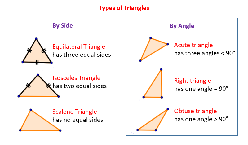
There are ways to get odd number amounts, including using even numbered items in places. Wait, what? Think of it this way. You can use a pair of sequins in one part of your card if you use three in another. 2+3=5, so you have an odd amount in the end. To add even more interest, arrange your odd number of things in an odd pattern. What do I mean by this? Try to avoid using equilateral triangle (like the top 2 left ones below), but rather, opt for the unevenly spaced ones (like the remainder of the triangles below).
Image result for types of triangles
https://www.onlinemathlearning.com/types-of-triangles.html


Another way to get an overall odd amount is by utilizing the visual triangle. The brain likes the flow of the triangle, so you are creating an odd number just by using an odd numbered shape for placement. Again, reference the type of triangle you are using. My triangle starts at the squirrel, goes to the cloud and sentiment, then ends at the mushrooms.


I hope you found this oldie, but good principle helpful and maybe learned the reason why it works. I shall be back tomorrow for another design principle. For now, don't forget to leave a comment for your chance at winning some deeply etched red rubber.

Until tomorrow, happy stamping!

Tuesday, June 4, 2019

GIU Day Two - Design Principles

Welcome back to day two of my GIU week. Be sure to comment for your chance at winning some deeply etched red rubber of your very own.

Today I'm all about the texture. I feel that texture is an important design element as it helps bring a sense of 3-D to a 2-D medium. Our brains love texture. Think about looking at something perfectly smooth, say a clear marble. There isn't much interest in looking at a clear marble, your eyes just sort of glide over it and move on to the next thing. But we're trying to engage the viewer, make them linger, so think of one of those fancy marbles. You know, the ones with the cool inside swirls. Your eye lingers over these marbles, trying to figure out how they got so much texture inside. They take up the same space, yet the cool marbles seem more 3-D that the clear ones; there's something flat about them, even though they are round.

Cool lesson, Mooney, but how does this relate to cards? Glad you asked! We want our viewer's eyes to linger over our hard work and adding texture helps with this. We are working in a 2-D format, so how can we add texture.

Texture Using Textured Items

I know that sounds kind of simple, but I think we often forget the value of textiles on our cards. One of my favorite textiles to use is burlap. Burlap is so interesting and can be used in many ways. It can be used as mat, in place of paper. It can be used like one would use a banner or washi tape. It can be used to ground, even as ground itself. You don't have to stick to burlap though. Fabric, twine, pom poms are all examples of textiles. You can even fold, tear, and scrunch paper to give texture.


Texture Using Art Mediums

There are a variety of textured art mediums out there. Modeling paste, gesso, mousse, glitter, thick paint, you get the idea. These items can be used just straight on the page, through a stencil, stamping, the sky is the limit. Adding these to your project draws your viewer in and makes them want to touch it.


Texture Using Dimension

You can create texture just by adding dimension. This litterally takes your 2-D project and makes it a 3-D one. The most popular and easy method is to use pop dots or foam tape. I love the look I achieve by elevating parts of my card. Another way to add dimension is to add layers. Paper layers really do a lot to add physical dimension as well as perceived dimension. As you can see, I even added distressed edges on two of the papers and crinkled my deli paper, adding even more texture.


Texture Using Illusion

We don't have to use actual texture or dimension. There are ways to fool the brain into thinking there is dimension on a card. This is particularly advantageous on a single layer card. Here are some ways that I use illusion to create texture.

Texture background stamp: Unity has a number of awesome texture stamps. I'm thinking the newest stamps by Brutus Monroe, for example. You can have the look of textile with just ink.

Splatters: I'm not sure why splatters add texture, I just know if I feel a card is missing something, I often add splatters. Maybe our brains think those lil dots of ink are raised.

Masking: you can give the illusion of dimension by masking your focal image, then adding the background on top of it. Once you pull the mask off, you're left with the feeling that it's actually popped up, when it isn't.

Shadowing: Adding a shadow around a person or object fools the brain into thinking they are 3 dimensional instead of flat pieces of paper. Don't forget to shadow and highlight within too. The brain thinks there are valleys and hill that the light is hitting differently.


I hope you found today's post useful. These are just some things that I think about when I'm creating.  Be sure to comment for your chance to win the deeply etched red rubber and while you're at it, subscribe via email so you can keep up to date at what is going on in my craft room.

Until tomorrow, happy stamping!

Monday, June 3, 2019

GIU Day One - Design Principles

Yay, I'm so excited to be your GIU this week! I've decided to bring some basic design principles for card making and scrapping, for that matter. I love to always be learning and why things work and what engages the viewer, so I hope you find these helpful. If not, you can at least look at the pretty cards! Oh, and possible win some deeply etched red rubber of your very own. Who wouldn't want that?

Today's lesson is on grounding. What does that mean? Does it mean always including a ground in your work? No. It simply means anchoring your focal image so it isn't "floating" there, confusing your viewer. There are many ways to ground and most of them don't include dirt.

Grounding to the Ground

Ok, well, one of the ways is to ground to the "dirt". I love the Angie Girl line and I like to make sure the head to toe girls are grounded and not floating on my card base. The brain is confused as to why she's weightless otherwise, even though it is just on paper and 2-D. This doesn't just hold true to people, but objects too.


Grounding to Design Elements

Not all Angie Girls are head to toe. Some are just the torso, so how do you ground these? Glad you asked! You can ground them to the additions you make to your card. Some twine, washi tape, a banner, your sentiment, a die cut shape. This way she isn't a ghostly apparition, just floating there. And as above, the principle works for all sorts of objects. No ghosts carrying vases either.


Grounding in the Sky

Ok, you'd think that you wouldn't need to ground say a hot air balloon or a bird, because they are in the sky and meant to float. No, the brain understands this, but I always feel like my card is more complete if I do anchor these things. Clouds are my favorite way to anchor in the sky, but birds or design elements work too, even a sun. I'm not sure why I feel like they hold up my balloon or whatever, but they do.

I hope you have found this helpful. These are just some of the things I think about when I'm assembling my cards.


Be sure to comment to be entered into the random drawing for a grab bag of deeply etched red rubber, from your favorite stamp company! And be sure to follow me and subscribe via email to keep up to date on what's going on over in my part of the world.

Until next time, happy stamping!

Saturday, June 1, 2019

Newport Bridge

Happy June! It's time for a new CSI challenge. I loved the colors of this case. It reminds me of the coast, so I grabbed these photos of the bridge over the Newport Bay. It's such a cool looking bridge. I took the photo when I was out testing my new camera. 

I decided to use a dark background. I don't use that very often and I like how everything just pops off the dark page. I also forget to use the negative pieces when I die cut, so I added a negative cloud too.  A couple of stacked banners, sequins, and flair, from A Flair For Buttons finished off the piece.


image 0

image 0


Friday, May 31, 2019

Graciellie Designs Birthday Blog Hop

Good morning! I am excited to to be joining Graciellie Design's team of Ambassadors. Graciellie is an artist I deeply admire and her heart is as beautiful as her art.

Today we are having a blog hop in honor of her birthday, showcasing the June release of new digital stamps in the shop. First up is this gorgeous daisy from Tulips and Daisies. I printed off one large flower and two small. I went with the simple white flower palette, just giving the valleys some simple shading, with a pop of yellow in the center. I arranged them on this fun Polka Dot paper from the Summer Sunshine digi paper pack and double matted.


My second birthday card features Hey Friend. I watercolored the feather, leaf, and flower. I cut the base out using a wonky stitch die, wrapped some twine, added my sentiment, and again double matted. 


I hope you have enjoyed this stop in the hop. Be sure to visit all the blogs and comment for your chance to win $25 to the shop! You're going to want to win this and pick up some fabulous digi stamps and/or paper packs. Until then, enjoy 40% off everything in the shop, no coupon needed.

Next up, be sure to visit the fabulous Sathya Kala for your next stop in the hop. And start here if you need to find the beginning.

Until next time, happy crafting!